November 29, 2006

Meeting with Richard Bailey

Before class I met with Zeth's friend Richard Bailey and he quickly drew up some really nice images based on the photo I have of Justin.


I had already decided that I would not build a rig and instead use the Norman rig given to us for Character 2, and now, looking at these drawings, I have decided to scrap the model I built of Justin and instead really stylize him based on these drawings. I hadn't believed that the proportions could be pushed so far and still resemble Justin so much, but its all about keeping some of the features--shape of nose, type of hair, hat...etc. So it looks like I have quite a bit more work ahead of me than I had originally planned. Oh well, c'est la vie.

November 22, 2006

Putting together a puzzle
during a meteor shower


Okay, here's a new snag. After completing my second animattic I've realized that there is no way Justin can assemble the entire puzzle ball between the 2nd meteor shower and the end of the song...its about a third of the entire piece--maybe if he knew exactly how the pieces fit together this would work, but the whole point is him exploring these pieces and figuring out how they fit together.

Brainstorming Ideas:

The Texturing Solution:
Unlike the original puzzle ball which has completely random solid colors so that the pieces don't relate, if I texture the ball as a solid piece (a la the soccer ball assignment) then it will be far more obvious how the pieces fit together. This still doesn't solve the timing issue, but its a start.

The Timing Solution:
Instead of having all the pieces fall during the 2nd meteor shower, they could fall progressively, one after another (in the right order, even) which would allow a little time for Justin to interact with the new piece and to figure out how to fit it in to the growing orb.

The Hosenfeld No-gravity Idea:
As Hosenfeld astutely pointed out--this is outer space--there doesn't have to be normal gravity. I had already been picturing duplicated versions of the pieces I've built floating around in outer space to fill out the environment somewhat. In addition, the pieces don't necessarily have to fall to the planet, they could merely float by. This makes the border between fate and chance a little blurrier, so I'm thinking perhaps I will have pieces float around, but not the ones he interacts with. (Another good idea from Hosenfeld--have a piece or two float right in front of the camera, really bring the camera into the environment)

Issues:
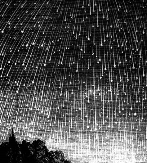
These are all good ideas and can be incorporated together to work as a whole, however, the timing solution breaks up the three distinctive meteor showers that I had occurring at the beginning of each stanza. I really like the visual structure of these showers...the repetition of three...the progression from medium to heavy to light. Somehow I have to integrate pieces falling in a paced manner--ideally in relation to the song--while still having three distinctive showers. As well, how the meteors in these showers interact with the asteroid fragments floating in space needs to be addressed.

November 15, 2006

Texturing Trials

So this week the focus has been on texturing the piece...and I've started to brainstorm how to get the look I want. I started by taking the image I have of Justin (below)

and applying the cutout filter in photoshop to him. This gives the toony ramp-like look that is used for toon shaders...

however, the borders here are based on actual changes in color on Justin's body, not from the light fall off of the scene. The first time I did it I used 8 levels, 4 for edge simplicity and 1 for edge fidelity. I decided to decrease the number of levels so as to up the graphic nature of the piece, so instead of using 8 I dropped to 2 to get

This is a really interesting iconic look and definitely has the grunge feel that I want. It does lose some of the subtlety of the image and definitely veers away from the Little Prince/Missing Piece innocence.
Meanwhile, I've been attempting to hone the drawn feel, and I've concluded that the best and seemingly only way to get a drawn look is to actually draw myself and scan in the image. So I used the Find Edges filter on the original photo of Justin and printed the image...then using a thin marker I inked the more important lines loosely to thicken them and add line quality. Afterwards I scanned the image in to get this:

Layering this on top of the most graphic image and using the multiply filter on this layer to blend them, I got a little closer to my goal of drawn textures...however, the drawing was too rough relative to the simplicity of the color layer so I applied the cutout filter to the drawing to simplify it a little. The result is below

This is starting to feel like something...as Lauren pointed out, the beard inking and the crease lines around the nose age him too much, so perhaps these should be left out...but this is starting to feel artistic and realistic and toony all at the same time, which is the goal. Maybe adding a layer between the background color and the line drawing of some sort of texture to break up the background a little and make it slightly more artistic and less graphic....hmmm

November 8, 2006

Post First Industry Review

We met with Galen on Saturday and he seemed to like all the research I did (though Hosenfeld suggested I minimize the talk about research in the future). Galen's main comments were to figure out the style of the piece ASAP because that will determine how detailed the facial animation needs to be--as well as how humanistic it must be. If the face is divided in the normal human ratio--eyes halfway between chin and top of head and nose halfway between eyes and chin (see below image)--no matter how cartoony the texturing or other parts of the body, we read it as human and expect a high level of detail in the facial movement. I don't really think there is anyway around having Justin look human, so it means a lot of detailed blend shape work...perhaps all the time I've saved on rigging will go towards blend shapes and facial controls.


He did say that the long camera moves will allow me to complete the thesis as long as I focus on the detailed animation for close-ups and simpler, broad movements during the camera moves. I should consider the camera moves storytelling and the close-ups as the showcase of my character animation talent.
So this week I've begun to explore shading in Maya. I think I want to use toon outlines but with a more complex texture on the body, similar to the texturing I used for "The Temptation of the Elephant" (fourth one down on the page). I'm reworking laying out UVs, though I'm learning that I won't really learn how I want them exactly until I start building my texture.

November 1, 2006

Animattic Ver. 2

This week I introduced a camera rig into the animattic and worked on cutting between camera shots to alternate between large sweeping shots that reflect the song's pace and close ups for character animation focus. Some stylized camera work was added to enhance the dreamscape that is implicit in the music, the lyrics and the narrative. One such shot moves in to the first piece that lands in Justin's hands and pans up and over the piece, revolving and rising--intending to convey the fatalistic way the piece has landed in Justin's hands, the master plan that the universe has for us. As well, the shot subtly connects the piece to the one Justin is sitting on which is exactly the same shape.
I have yet to alter the animation of the protagonist to fix the puzzle-solving time issue. However, the worry I've had over building a good enough rig is gone once Leif and Nick suggested I merely skin my character to the Norman rig. This not only allows for more time to animate and less time building a rig but also means I can create at least a very basic animation within the animattic using Norman and import my character later and skin it to the rig. I can move to -100 on the timeline and keyframe Norman in the bind pose so that I can later go back and skin my model in the default pose. Of course I will still have to play with skin weights and perhaps adjust the proportions of my model or the rig to match, but theoretically a lot of time should be saved.
I have also reframed the animation to the 16x9 that seems far more appropriate for my piece. Enjoy!